iOS App for On-Device Signal Modeling
This is the second half of my project to build an iOS App capable of performing signal propagation modeling on-device. This article covers the development of the iOS app and leverages an ML model I designed and detailed in a previous post here. The GitHub repository corresponding to this project can be found here: https://github.com/connor-passe/Sig-Map
Sig-Map is an iOS app that will serve as an Minimally Viable Product (MVP) for this concept with the following features:
-
Ability to download and save terrain data locally
-
Display the extent of the downloaded terrain
-
Ability to mark the location of the transmitter
-
Ability to specify the (valid) signal frequency in GHz
-
Ability to set desired radius of interest
-
Capable of generating and displaying a signal strength heat map overlay
Sourcing / Pre-processing:
As during the training of the ML model, we will use the same Digital Terrain Elevation Data (DTED) from the 2000 Shuttle Radar Terrain Mapping (SRTM) mission. Specifically, we’ll be using the 1 Arc Second resolution (~1 sample every 30 m). The data was pulled from the United States Geological Survey’s EarthExplorer.
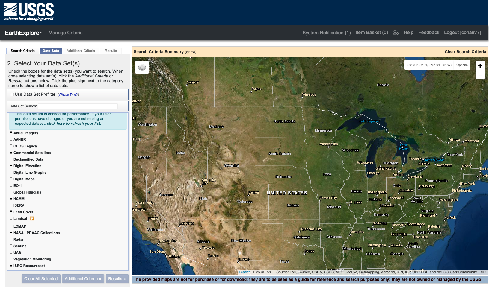
USGS’s EarthExplorer
Data on the entire globe is available, and can be downloaded in 1º x 1º latitude / longitude “tiles”.
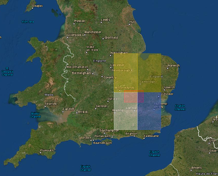
The 4 Example DTED Tiles
DTED is not user-readable, but can be parsed fairly easily using a Python package called dted. After some wrangling, the DTED tiles are converted into a CSV of latitude, longitude, and elevation for each point in the tiles.
Processing On-Device
With the tile CSVs created, they can then be loaded into Xcode. TabularData, a Swift Framework designed to work with large amounts of data will fit this project perfectly. We read the CSV into a TabularData DataFrame (basically a Swift version of a Pandas DataFrame with much less documentation).
DataFrames enable very efficient processing of data, and will enable the required rapid on-device distance and elevation difference calculations. Swift has a built-in distance calculation function between two coordinates (saving us from having to implement the Great-Circle Distance Formula). The result is in meters, and must be converted to kilometers through division by 1000. Elevation difference is comparatively simple, just subtracting each point’s elevation from that of the transmitter’s.
With a DataFrame containing the two columns of features, the app is ready for the ML prediction model. A separate data struct is used to store the coordinates of the tile edges to know where to eventually place the heat-map.
ML Model Prediction
For each row of the DataFrame with a distance value less than the selected radius, a prediction is calculated. Calculating signal loss with our model is more costly than simply assigning it a constant value, so predictions are only calculated within a certain radius. As a reminder, circle area is: A = πr² which means the number of points included in the radius is n² (with respect to radius).
Bounding the predictions at the 5–10 km scale is valid for the frequencies we’re interested in (915 MHz to 5.85 GHz). After a distance of ~10 km the signal loss is so large it’s negligible.
HeatMap Generation
After running MLCalculation(), there is a 1D array of power loss values or placeholder values of -1 representing points outside the radius of interest. The placeholder values remain within the array to maintain it’s shape. The power loss array has the same order and size of the original DTED tile. The array acts as a flattened “image” with intensity values corresponding to the amount of signal loss at each point. It can now be re-assembled into the heat-map.
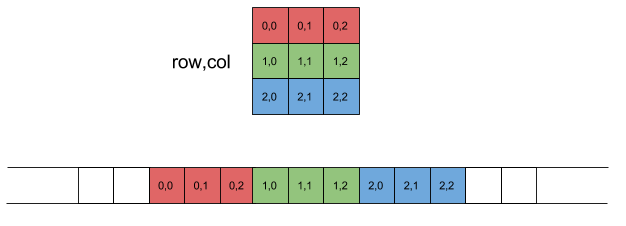
Visualization of DTED <-> Array Conversion
Swift’s UIImages enable individual pixel control, which enables iteration through a base image (with the same dimensions as the original DTED Tile file) and mapping each signal loss value to a pixel color value. The ML model’s power loss prediction values range from 50–190 dB. A custom gradient formula is used to map each to a corresponding color ranging from green to red, respectively.
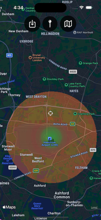
With the heat-map image created, the final step is overlaying it on the map. Using an MKOverlay the heat-map image can be placed in the exact same location as the original DTED tile.
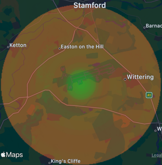
Location Accurate Heat-map
Combine and Create App Layout
With the base functionality hammered out, it’s time to package it all up. A simple layout will suffice for this project. With the map as the primary screen and three buttons we will be able to achieve a clean and intuitive app.
Button 1: Tile Selection
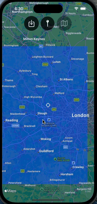
The app comes included with four adjacent tiles, each in the southern half of the United Kingdom. Tapping the button brings up a confirmation dialog with four tile options. After making a selection, an overlay of the tile’s boundary is displayed on the map.
Button 2: Place Transmitter
Disabled until a tile has been selected, the second button enables the placing of a Transmitter pin on the map. This pin is an MKAnnotation and serves as the location of the transmitter. It can be placed anywhere on the globe, although for interest’s sake placing it within the boundaries of the selected tile is recommended.
Button 3: Set Heat-map Preferences
Once the transmitter is placed, the final button is enabled. Tapping brings up a sheet with heat-map preferences. The user can set the transmission frequency and the desired calculation radius. The frequency must be a positive value and the radius an integer ranging from 1–10 km. Attempting to generate the heat-map with a zero or negative frequency value throws a warning.
With a valid frequency the app generates a heat-map and displays it on the main map.
The app will pause while performing the heat-map computation, and can vary in duration depending on the radius. Preparing the data and displaying the image are done in constant time, but the MLTransform function has a quadratic runtime in regards to radius. Below is a table with runtime measurements from a real device.
Conclusions & Final Thoughts
Sig-Map was able to achieve the goal of building a fully on-device signal propagation modeling app, capable of generating a 201 square kilometer (8 km radius) heat-map in under a minute.
With additional time there are a couple other features that would be interesting to add to the app. These include:
-
Ability to download DTED tile data directly within the app
-
Additional data compatibility (such as LIDAR point clouds and satellite imagery)
Both could be accomplished by leveraging the USGS’s public API’s which provide access to all their publicly available datasets.